Reports from our 2015 Meetings
![]()
![]()
![]()

![]()
![]()
![]()

Reports from our 2015 Meetings
This month we reviewed the concept of responsive web design. Responsive web design is the idea of creating one site that looks good no matter what device is used to view it. So the same site will render properly on a smartphone and tablet, a desktop or maybe even a smart TV.
There are three main components to responsive design, Fluid layout, Media queries and fluid images. We started the meeting with a look at how we could scale a site. A fixed site was used because monitors usually had a fixed pixel size. Pixels are used to determine both page and font size. Pixels are not scalable. To scale a font or even page size, we can use either a percentage or a measurement called EM. EM is a paper print measure of the ratio of the height to the width of a single tile or print character, and it’s scalable.
The next idea we looked at was media queries. These are used to change how the site displays at various sizes. Often by changing something how an item such as a menu is displayed or the position of the item on the page. The queries use breakpoints. They are the points at which items in your page will be changed to accommodate the new screen size. You can use pixels or Ems to determine break points. For a small screen a typical point may be 320px. At that point a media query might be used to place the side by side layout into a horizontal one.
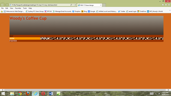
Here is an article on finding breakpoints for media queries. and one the shows how text will look at various EM settings.To see how that works we created a dummy site in Expression Web and used percentages and EMs to described the size of each of the parts of the site. The body was 100% then we added a container at 90%. Inside the container we added a header, a navigation div, an aside, a div for content and a footer. We made the header and the nav 100% of the container, the aside was 20% and the content at 80%. The footer was 100%.
Here’s the result.

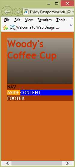
We then added a media query to see how we could change the look of the site at a small screen. We used the content div and changed some of its settings.
.content
{
width: 80%;
background-color: #FF9900;
float: right;
background-image: url('../img/2-thumb.jpg');
color: #FFFFFF;
}
The media query removed the contents background image and changed the colour to blue if the size was 20em or 320px
@media (max-width:20em)
{
.content
{
background-color:blue;
background-image:none;
}
Here is the result.

You need to change the fixed widths to fluid ones. We have two choices use a percentage value or an EM value.
To change the fixed pixels to a percentage we divided the overall size in pixels by the size of the element.
The formula is” target / contain =result X 100 = %”
For example we have a container div of 900px which holds an aside of 300px and a content div of 600px. Divide the content div, 600 px. by the size of the container div, 900px then multiply by 100 The result is 66.66%
The other option would be to convert the PX value to EM.
The default size for the font in a browser is 16px. You can reset this default size in the css if you wish.
The default of 16 px is equal to a 12 point type face. 12p = 16 px = 1 em. The formula for converting a fixed pixel therefore is,
1/16 (if that is the default font size you used) X px = em OR 0.0625 X px = em.
So
the EM size for our 900 px div would be; 1/16 X 900 = 56.25.
Better still we can use a calculator
like px to em
We run out of time to discuss fluid images but the main solution for a fluid image is to add “max-width=100%” to the css element. This makes the browser scale the image down from its original size but not expand it.
Steve South
Sig Leader