Reports from our 2016 Meetings
![]()
![]()
![]()

![]()
![]()
![]()

Reports from our 2016 Meetings
This month we looked at flexbox. Flex is a new CSS element which allows for a more flex able form of layout. Until flex creating layouts was a rather complex fit of padding, margin, float and position Enter Flex. Flex is a new css format that allows for the easy positioning of elements even regardless of the position in the html document. When it came to creating layouts the one thing I have found most annoying was trying to get a background colour in one column to flow the length of the its larger neighbouring column. Flex makes that easy.
We started the afternoon with a look at the history
of layout, first designers used tables to create layout, then come the
development of the now standard float, clear, margin, padding and
position elements. Then they devised the grid system which had a complex
maths to determine the placement of layout containers in rows and
columns
Flex is a nested command, any element inside the flex element is a flex item and the flex properties determine the elements layout. In simple terms this means that Flex works on the children or nested elements of a parent element and the flex item is simply the child of the flex container. The complexity and maths behind margins and padding is reduced to a few simple commands like “space-around” which appears to equal “margin” and “space-between” which appears to equal “padding”. To demonstrate Flex we ran through the exercises in W3C Schools site.
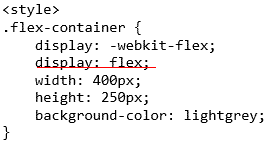
A flex box is started with the command “display: flex”. To this is added host of other properties which give flex it’s flexibility. Properties that allow you to align, justify and even re-order the content without change the position of the content in the html document, the dom. Normally flex is used to order the html as a block element but it can be used to order inline elements. By using the property “display: inline-flex” You could tailor items in a paragraph or the navigation elements of an inline menu. This article from Stackoverflow.com throws more light on the idea.
In these exercises the W3C Schools used class called ” flex-container” and “flex-item” . The flex-container housed the “display:flex” command. “Flex-item” is a child of “flex-container”. The class names are not set, in fact you could use ids if you need. You can use any element or any name; if it contains “display: flex” it is a flex container and its children are flex items.
As an example, apply the class "flex" to a a side navigation menu and it becames a flex container and displays as a column.
<nav>
<ul class=”flex”>
<li>item</li>
</ul>
</nav>
And the CSS may look like this
Ul {
Flex:display;
Flex-direction:column;
}
Here are a few results of our exercises
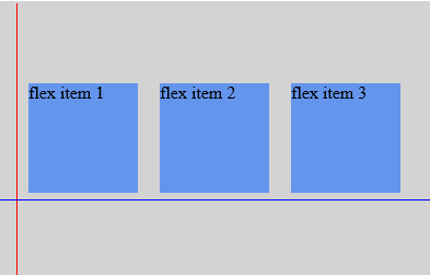
The display flex placed the items in a row at the top left corner.
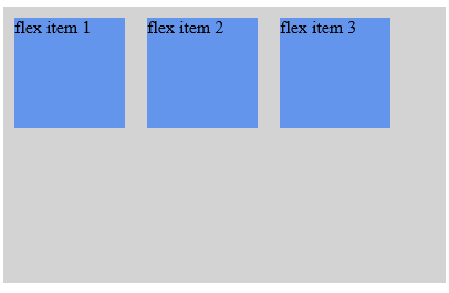
Here we added a flex direction of column.

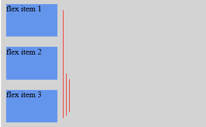
You can reverse the order using column reverse

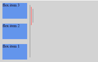
We looked at how to align the items. Here we have centred the items on the page, the horizontal position is"justify-content: center;" and the vertical position is "align-items: center;".

After that we worked on a practical example using a template on our site. In the html we had created a background div in which we placed the main content. This was the css used to centre the main content using margins.
#main
{
margin-left: 10%;
margin-right: 10%;
border: 1px solid #FF0000;
padding:1.25%;
background:black;
color:white;
}
#background
{
border: 2px solid yellow;
background: green;
}
To use flex we reversed the order making the background div a flex container and told it to centre the flex item that is the main div. Note we removed the margins properties from the main id and added the three flex properties to the background.
#background
{
display: flex;
align-content: center;
justify-content: space-around;
border: 1px solid #FF0000;
border: 2px solid yellow;
background: green;
#main
{
/*margin-left: 10%;
margin-right: 10%;*/
border: 1px solid #FF0000;
padding:1.25%;
background:black;
color:white;
}
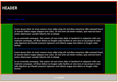
All this was achieved without re-naming or re-writing the divs in the html.
<div id="background">
<div id="main">
<section>
<article>
<p>Lorem ipsum </p>
<p>ex ea commodo consequat. </p>
</article>
</section>
<section>
<article>
<p>Lorem ipsum </p>
<p>ex ea commodo consequat. </p>
</article>
</section>
</div>
</...end main.../>
</div> </...end background.../>
To finish we looked at some of the resources including a free tutorial by Sean Fioritto anyone can subscribe too.
http://www.sketchingwithcss.com/flexbox-tutorial/
The tutorial comes with this great cheat sheet.
http://www.sketchingwithcss.com/samplechapter/cheatsheet.html
Here is a slide presentation by Rachel Andrew one of Brittan’s leading CSS layout gurus. It shows the evolution of flex from floats and margins to how to layout flexible grids.
https://speakerdeck.com/rachelandrew/flexible-boxes-and-grids
and here is a CSS tricks resource titled “A Complete Guide to Flexbox”.
https://css-tricks.com/snippets/css/a-guide-to-flexbox/
This one gives a great comparison between the old methods and flex, great for older browsers.
Steve South
Sig Leader