Reports from our 2017 Meetings
![]()
![]()
![]()

![]()
![]()
![]()

Reports from our 2017 Meetings
This month Bob showed us the new grid layout system. The idea of a grid layout has been around since 2011 when Microsoft first suggested the idea. Which begs the question “Why didn’t Bob’s grid pages work in Edge for version 1703 or in IE11?”, however if you have the Falls Creators Editon thats version 1709, Edge works fine. The grid layout system is however accepted in all the other major browsers, Chrome, Firefox, and Opera.
This brief history of CSS grid is written by Rachel Andrews the “Guru of grid”.
What is grid?
Grid is a CSS layout system where areas in an html document can be displayed as a grid or table like layout. It is like flexbox which we looked at last year however unlike flex which displays either horizonal or vertical grid will display both vertically and horizontally. To start a grid, we define a tag as a grid by adding a property of {display: grid} to the css for that tag. Then, all the tags inside that tag, it’s children, become part of the grid.
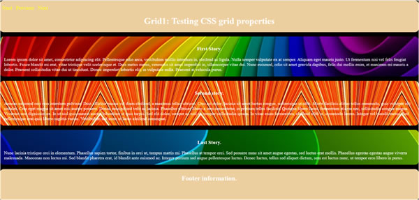
In Bob’s first example he created a div with a class of griddle.

In the html we can see the div with its class of griddle.
<div class="griddle">The menu went here and was floated left.
<div class="right">This ended the top cake left div
The html then defined the three areas for the story.
<div class="story1"><h3>First Story.</h3>ETC
</div> This ends the story 1 div
<div class="story2"> <h3>Second Story.</h3>ETC
</div> This ends the story 2 div
<div class="story3"> <h3>Third Story.</h3>
ETC
</div> This ends the story 3 div
Then finally the footer
<div class="bottom cake">
<h2>Footer information. </h2>
</div> This ends the bottom cake div
The CSS
In the css he defined the griddle class. Starting with display grid to define the grid.
.griddle
{
display: grid; This defined the content will be a grid
height: 100vh; The height is defined as 100 % of the viewport height
grid-gap: 1rem; He set a gap between the grid cells of 1 rem
grid-template-rows: repeat(5, 1fr); */
The repeat tells the browser there are 5 rows of equal space. This is achieved using the new Fr measurement. It stands for fraction and set at 1 it gives the rows equal space eg a 1/5th space each.
grid-template-areas: "left top right";
Here Bob defined the grid areas by position and name. There are three columns defined by their position, by setting the story’s under each other we have a vertical layout.
"story1";
"story2";
"story3";
"bottom";
}
In the css the top, bottom, cake and story classes are defined as areas by simply using their name.
.top
{
grid-areas: top; Here Bob has set the grid area by name.
}
.bottom
{
grid-areas: bottom;
}
.cake
{
border-radius: 15px;
background: #edcf9f;
grid-column: 1 / -1;
}
.story1
{
background-image: url("../assets/images/s-color1.jpg");
border-radius: 15px;
padding: 1em;
grid-areas: story1;
}
The other story areas are defined as story 2 and story 3.
Cake is used to control placement by having the top and bottom rows extend across the wide of the grid using “grid-column: 1 / -1;” 1 to -1 tells the browser to fill the whole space.
The second example Bob showed displays the stories in a vertical grid.

This is where it gets intriguing. Here Bob made a small change to the HTML, now the second div reads
<div class="left top cake">.
The css however literary stands the page on its head.
.griddle
{
display: grid;
height: 100vh;
grid-template-columns: repeat(8, auto); Here Bob changes the columns to repeat 8 auto which resets the columns from 5 to eight and auto sets the space to the maximum size possible.
grid-template-rows: repeat(5, auto); Here Bob has added rows to the mix.
grid-template-areas: "left top top right"
"story1 story2 story3"
"bottom bottom bottom";
And now Bob has set the grid to horizontal by placing the story names in inline. In the first example he set them underneath each other.
grid-gap: 1rem; Here Bob has set a gap between the cells to 1rem.
}
.top
{
grid-row: 1 / 2; Here Bob is saying the top row will span two columns. Its defined as starting in 1 and going to 2.
}
.bottom
{
z-index: 1;
grid-row: 5 / 6; Here Bob is starting at column 5 and finishing in column 6
margin: .5rem;
}
You will notice that class cake remains the same.
.cake
{
border-radius: 15px;
background: #edcf9f;
grid-column: 1 / -1;
}
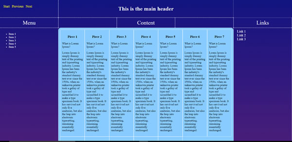
Bobs last example took grid to new heights with up to twelve columns inserted into a five-column group.

To start Bob defined the grid class with 5 columns and 4 rows.
.grid
{
display: grid;
grid-template-columns: repeat(5, 1fr); Here are 5 columns of 1 fraction each
grid-template-rows: .1fr .1fr repeat(3, 1fr) .1fr; Here we have two rows of 1 fraction each a repeat of 3 columns of 1 fraction and the last one of 1 fraction.
grid-template-areas:
"left header header header right" Here we have a left column a header that spans three columns and one right column.
The following then names the grid areas of the subsequent rows.
"head1 head2 head3 head4 head5"
"menu content content content links"
"menu content content content links"
"menu content content content links"
"footer footer footer footer footer";
}
The HTML
<div class="grid"> <div class="left">ETC
</div>Bob has five head classes, head 1 to 5.
<div class="menu">The menu is a simple UL list
</div>Then under the content class we find those twelve pieces each defined by a div.
<div class="content">ETC
</div>There is a div for each piece.Then the content div is ended.
Bob added a div for the links and the footer.
Heres the grid style
.grid {
display: grid;
grid-template-columns: repeat(5, 1fr);
grid-template-rows: .1fr .1fr repeat(3, 1fr) .1fr;
grid-template-areas:
"left header header header right"
"head1 head2 head3 head4 head5"
"menu content content content links"
"menu content content content links"
"menu content content content links"
"footer footer footer footer footer";
}
Then the content CSS
.content
{
grid-area: content; Here Bob is telling the browser the grid area affected is content.
ETC
display: grid; and the new class is defined as its own grid
grid-template-columns: repeat(auto-fill, minmax(140px, 1fr));
Bob then defined the columns as a repeating column filled automatically and if the size is maximum size is then the columns should be fraction of 1.
}
Thanks to Bob for the excellent demo.
The Guru of grid Rachel Andrews has an excellent site called Grid by example
https://gridbyexample.com/examples/
Here are some good YouTube videos by Rachel to introduce the features of Grid:
Short Grid Intro (2:57) Intro to CSS Grids (16:13) Grid Autoplacement (4:57)
and I found “A Complete guide to Grid” here
https://css-tricks.com/snippets/css/complete-guide-grid/
Steve South
Sig Leader