What we did
February 2021 : Some interesting tutorials from egghead.io
This month we had a look at an education site that has some free video tutorials that include the code examples in Codesandbox, it's a rival to Codepen. If you join Codesandbox you can edit the code yourself.
The three examples we looked at use a css preprocessor called scss or sassy css. To quote from https://www.dailysmarty.com/posts/what-is-scss
A preprocessor which lets you use features that aren’t a part of the wider CSS standard yet, and provides better workflows for maintaining your stylesheets.
In order to understand what the standard css looks like we had to convert scss to css so I used
CSS Portal
in which you can copy the copy the scss code and it complies a pure css.
The first one we looked at was “Create a Basic Responsive Grid System with CSS Grid”
Most grids layouts have this complicated setup with up to 24 items and complex methods of combining items to create headers and other objects you may need in the model. This tutorial starts with a simple one item grid then expanse the layout to a four item grid. So you get to know how to create a layout suitable for the layout you design rather then scaling down some huge 24 grid layout.
The key in this tutorial this single line of css code
grid-template-columns: repeat(auto-fit, minmax(10rem, 1fr));
First, we repeat the columns then it used autofit to take up any available space. Next it used minmax which we looked at in November and this uses a minimum size of 10 rem to a maximum of 1 fr, that is one fractional area.
The Second one we looked was “Apply Aspect Ratio Sizing to Images with CSS object-fit”
This tutorial looked at fitting images and logos into cards. Cards are the thing right now. It’s a way to corral an image and some text into a block that sort of looks like a business card.
The key with this tutorial appears to be the use of the "object fit" property, it is used to fit image and video into the container. The tutorial looks at two values, "cover" and "scale-down".
Here is the code used,
.object-fit-cover .card img {
object-fit: cover;
width: 100%;
height: 25vh;
border-radius: 8px 8px 0 0;
}
.object-fit-scale-down .card img {
object-fit: scale-down;
width: 100%;
height: 25vh;
padding: 1rem;
}
Cover keeps the aspect ratio but may clip the image to fit the space. Scale-down will keep the aspect ratio and shrink the image down as the item collapses.
Here is the result
This is at full screen.
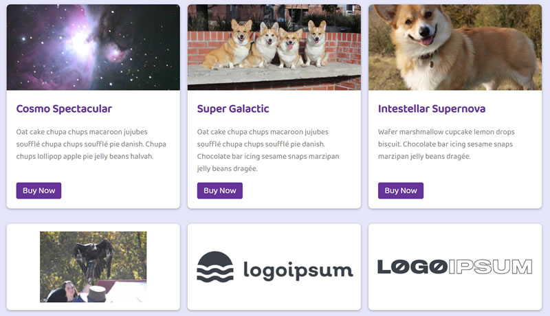
and shrunk down.
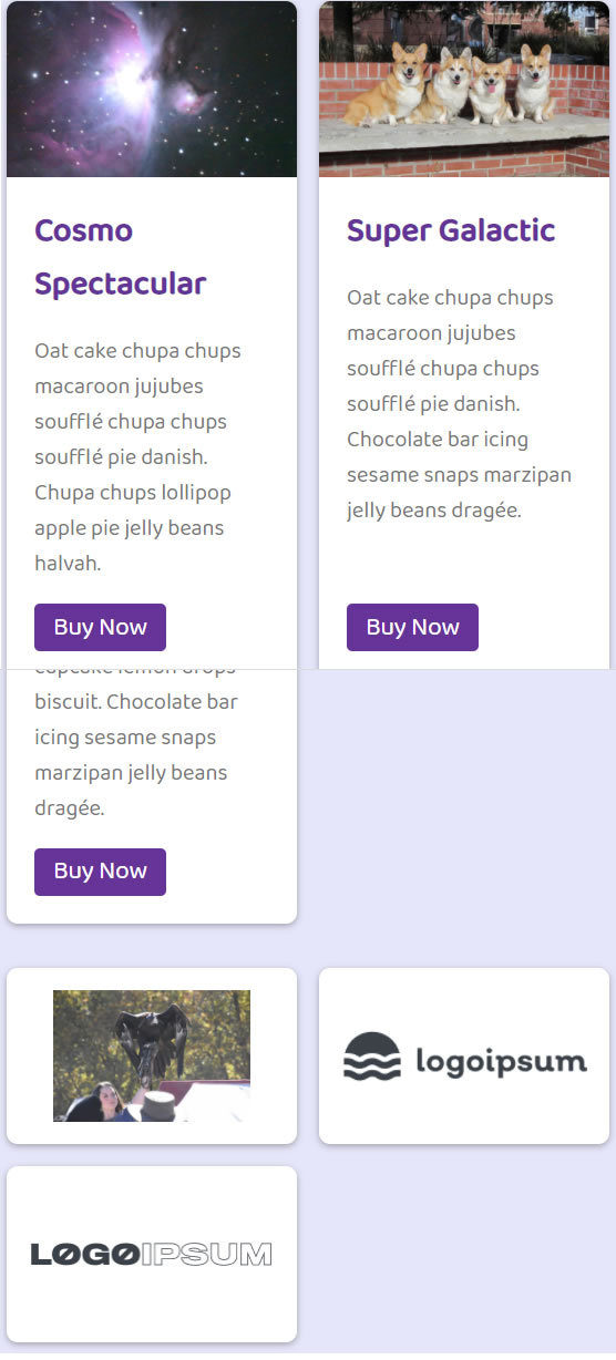
The third tutorial we looked at was “Create an Automatically Responsive Flexbox Gallery”
This example used flex to create an image gallery. The example set up a UL list then defined a class of gallery and made it flex with a property of wrap.
They then defined the LI with a flex grow of 1 a flex shrink of 1 and a preferred width of 15 rem.
flex: 1 1 15rem;
The other important item was the image which they defined as
object-fit: cover;
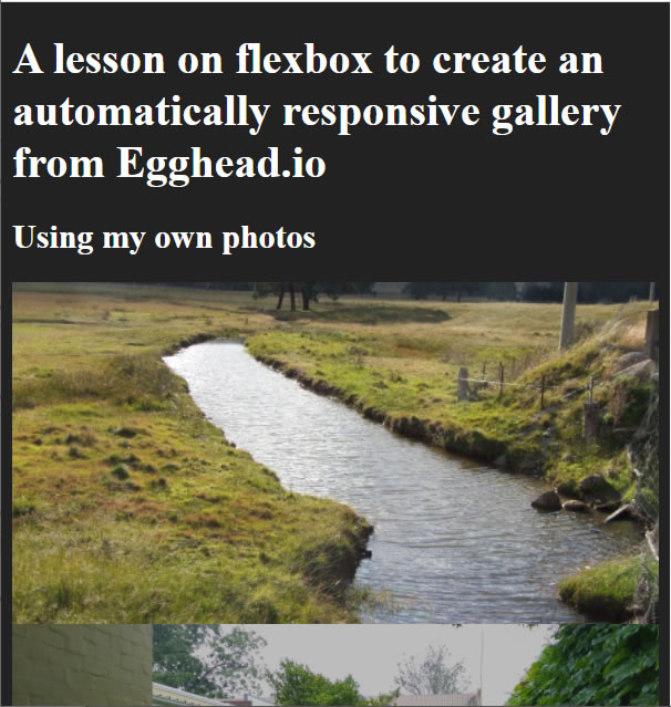
The effect was to have all five images in a line on full screen and a column on full shrink.
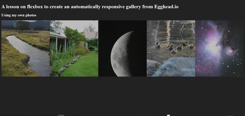
Here we see three images across the top as the screen is shrunk.
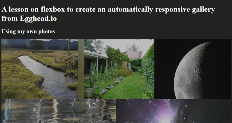
Here we see the images once shrunk to the minumum screen size fall into a column.
Steve South
Web Design leader