What we did
May 2021 :Focus
This month we focused on focus. So, what is focus? I found getting a definition of what focus was difficult. Here is Mozella’s web docs definition;
The :focus CSS pseudo-class represents an element (such as a form input) that has received focus
Great so what is focus?
Eventually I found a more complete definition at CSS Tricks
The :focus pseudo class in CSS is used for styling an element that is currently targeted by the keyboard, or activated by the mouse. It is generally triggered when the user clicks or taps on an element or selects it with the keyboard's Tab key.
Primarily there are three ways we interact with a site, the keyboard, the mouse or the touch screen.
Focus is a way the site can tell a person just where they are on a page by giving focus or attention to an element when it is tapped, moused or tab on. Naturally there are default browser CSS for focus and most articles begged us not to disable them as that would restrict access.
So, what happens when you apply a focus. The element will be highlighted in accordance with the selected pattern chosen in the CSS. Basically, focus means when you tab to an element that has focus the element will display as set by the CSS. Usually that means in say a form the tabbed input would say show a yellow background.
Most of the articles I read emphasise the need to use focus so those with a visual or motor disability can tell where they are on the site. Here are three I referred to;
Why you should use focus styles
The basic CSS code is
element:focus {
			  css declarations;
			}
The way you indicate a focus appears dependant on the basic purpose of the element. One of the major effects appears to be, outline where a focused element has an outline drawn around it. The other is the input element in a form where we you might see the input highlighted in yellow.
We then had a look at how focus worked by adding basic focus styles as suggested by sites like W3C Schools.
We started with a basic outline
a:focus {
				outline: 3px solid orange;
				}
This is the result,

Using focus on an input element
input:focus {
				  background-color: yellow;
				 }

We also looked at how you can use focus as a class.
			.red-input:focus {
				background: red;
				color: black;
				}
			.blue-input:focus {
				background: blue;
				color: yellow;
				}
Here’s the result.

First name was red and the last name was blue.

The next one we looked at was Focus within.
Focus within allows us to highlight the area outside the element we have focused on. This allows us to draw better attention to the element and the form or area immediately surrounding the element.
			form:focus-within {
				background: #00FF00;
				color: red;
				}
The Result. When you focus on the input element the form is highlighted in green while the input element is red
![]()
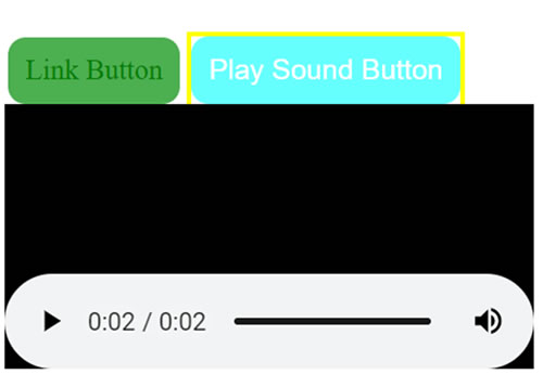
Lastly, we tried adding sound. You can’t add sound to css so here’s the way we got it to work.
We added a focus to all the buttons we created
			.button:focus {
				outline: 3px solid yellow;
				background-color: #66FFFF;
				}
Then to get a sound we had to embed one to the html
<button class="button"> Play Sound Button</button>
<embed src="../assets/sounds/Windows Background.wav" />
But we don’t want to see the player. So, we use this CSS to hide the player
			embed { display: none; }


  			button:active + embed { display: block; }
You can see the full explanation at CSS Tricks.
Here's what a focus button looks like.

Here’s the result when we clicked on the button.

All though the player was hidden when we clicked on the button, we can see it briefly.
Naturally you can’t’ hear the sound but it did play.
Steve South
Web Design leader