What we did
July 2022 : Divs and Code generators
For July we discussed an article John L found on DIv’s and how they work. It’s titled “Div divisiveness” by Scott O'Hara. The div is an HTML element which has no meaning. Most HTML elements are semantic that is they have meaning.Scotts has a look at the history of the DIV and then how to make use of this meaningless element.
If we look at the basic structure of HTML we find the main structural elements are Head, Body, Header, Nav, Main, Aside, Footer and as the names imply they suggest how they should be used. Then there are elements used within the main element like Section, Article, H1 to H6 and P(aragraph). So the Div has no semantic meaning to quote from MDN
The HTML element is the generic container for flow content. It has no effect on the content or layout until styled in some way
using CSS (e.g. styling is directly applied to it, or some kind of layout model like Flex box is applied to its parent element).
We then had a look at some Flex and Grid code generators that help you create CSS for the page design you want to create.
The first one was Griddy io
This one simply adds columns, rows, gap sizes and alignments. It then generates the code including creating a grid template. This one is for four items in two columns.
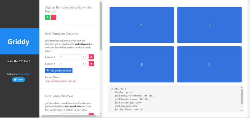
This one only generates CSS with ne HTML.
Here’s the code
			 .container {
    display: grid;
    grid-template-columns: 1fr 1fr;
    grid-template-rows: 2fr 100px;
    grid-column-gap: 20px
    grid-row-gap: 20px
    justify-items: stretch
    align-items: stretch
 }
The next one was Layout-it
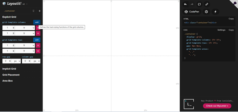
Again, we created a two column two row layout, this one generated the HTML as well as the CSS. Here’s the code
HTML
<div class="container"></div>CSS
			.container {  display: grid;
  grid-template-columns: 1fr 1fr;
  grid-template-rows: 1fr 1fr;
  gap: 0px 0px;
  grid-auto-flow: row;
  grid-template-areas:
    ". ."
    ". .";
}
We also looked at two Flex generators. The first was Loading io
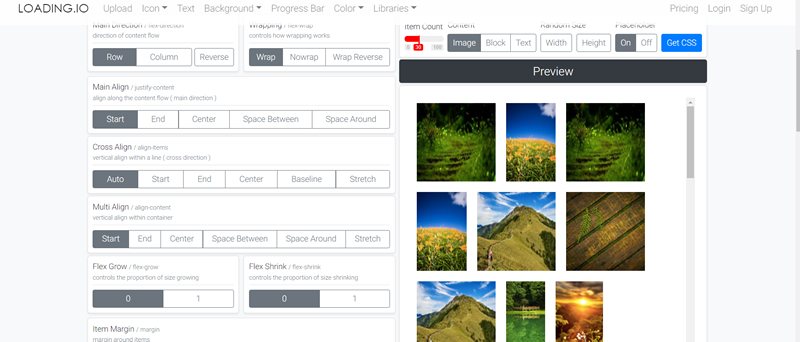
It had all the usual additions like rows and columns, flex direction, alignments and wrap controls.
You then copy the CSS.
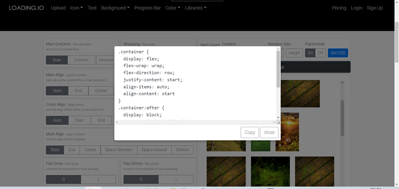
Here’s the code
.container {
  display: flex;
  flex-wrap: wrap;
  flex-direction: row;
  justify-content: start;
  align-items: auto;
  align-content: start
}


.container:after {
  display: block;
  content: " placeholder ";
  margin: 10px;
  flex: 999 999 auto;
}
.item {
  flex: 0 0 auto;
  margin: 10px;
}
Last we looked at Flexy Boxes
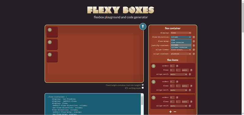
This one has dropdown boxes to help create your custom flex box arrangement. You then have to copy and paste the CSS. It doesn’t generate any HTML.
Steve South
Web Design leader